Product Review: Rhodia “Webbie” Webnotebook

The Rhodia Webnotebook (or, as people online have dubbed it, the “Webbie”) has an asinine name, but that name shouldn’t prejudice you against the object itself, which is the best notebook I’ve tried since switching away from Moleskine.

Numerous rapturous threads are devoted to this notebook on the Fountain Pen Network (“FPN” to the regulars), which is one of these sites that prove how well-suited the Internet is to connecting people with bizarre, niche hobbies to one another. Being one of those people, I say that with affection. Many, many FPN writers are ecstatic at the prospect of a mass-market notebook whose pages will not let ink bleed through.

Ink bleed was never a problem with Moleskines for me, because I use extra-fine nibs and apparently don’t use inks that saturate paper like rivers do handkerchiefs. Regardless, the Rhodia’s paper is excellent. It’s supposedly acid free too, so the paper won’t degrade before you do under normal use. I’m happier about the durability: I’ve used three Rhodias. None have come close to breaking. A Moleskine broke (though many earlier ones didn’t). An insanely expensive Design.Y notebook broke. A Leuchtturm 1917 has perforated back pages and will probably break.

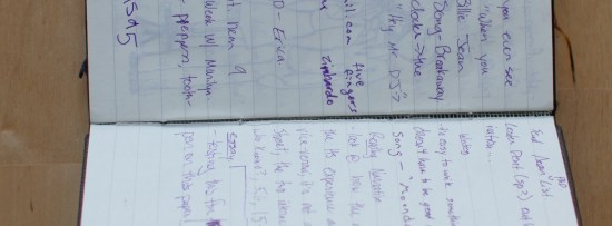
_MG_8481The Rhodia isn’t perfect. The lines are spaced slightly too wide, at 6.35 mm per line (or .25 inches); they might be great for someone learning how to write, but for someone who already knows, they’re not as useful, and it’s harder to connect ideas on one page to ideas on another. An ideal notebook should be closer to 6 mm per line. Moleskine gets this right. The edge of the cover should be flush with the paper, not a couple millimeters out, forming an unsightly lip. The lines should run to the edge of the page; the current design wastes space, and this is the most important design flaw in the Webnotebook.

They’re small problems that I’d like to see addressed but that don’t detract from the big things. Speaking of size, you can also buy A7-sized notebooks (which are about 4.7 x 3″) from Europe or Australia if you’re willing to pay the obscene shipping. I am, because they’re perfect.

I sent an e-mail to Goulet Pens to ask if they could get A7 notebooks, and Sam Vaughn responded to say that they “can do a special French order for them,” but “when ordering direct from France we have to order by the carton which in this case would be 40 notebooks.” Alas, 40 notebooks would probably be $500 and last for decades. The A7 is a more pocketable size than the 3.5 x 5.5″ American version. Choose it if you can.

Then stop looking and start writing.

EDIT: Rhodia makes much larger, 5.5 x 8.5 notebooks as well. I don’t have any use for them, but visual artist types might.

Design.Y Notebook Review: The Record 216

EDIT: I sent an e-mail to Design.Y about the binding breakage described below, and they sent me a new notebook. I’ll write another update when I’ve filled the new one.

EDIT 2: The new one broke too. I’m not going to use these anymore and am switching to the much cheaper and much more durable Rhodia Webnotebooks mentioned below.  

The most salient feature of the Design.Y “Record 216”* is its price, which varies with the Yen-to-dollar exchange rate but currently hovers around $70 with shipping. Those of you who can do simple math are probably thinking that this is about 35 times greater than a drugstore pocket notebook and fives times a Rhodia Webbie. I want the Design.Y notebooks to be five times better. Hell, I want them to be twice as good. But while the notebook is certainly a lovely object that’s been lovingly packed, like a florist’s rose or an undertaker’s corpse, the Record 216 suffers from one major flaw: the paper is too thin.

I’m constantly crinkling it or creasing the corners or bending the middle when I mean to turn the page (see the photo below for an example). The paper is definitely a joy to write on, but a heavier version would be an improvement; thinner is not always better, as anorexia counselors will remind us. Some pens will bleed through, as shown in the picture to the right. The bleeding problem is not great with my fountain pen, but then I use a extra-fine nib that’s about as slender, if not more so, as the Pilot G2. Users of thicker nibs may have concomitantly greater problems. Still, I can forgive the bleed-through problem. It’s the lightness that bugs me, and the way I subconsciously worry about bending a page when I’m merely trying to turn it.

Almost everything else about the notebook is incredible. It’s been in my pocket for months without suffering any problem greater than a frayed band. The size, at 5.3″ by 3.1″, is quite handy, and I’ve come to like it better than the standard 5.5 x 3.5 size of Rhodia Webbies, Guildhall, Leuchtturm 1917, or Moleskine. The 3.1″ width makes it feel much more portable at no cost to usability; if anything, the sense of a long, narrow column is an enhancement. The line spacing on the page is neither too great (as it is on the Rhodia) nor too small, and lines extend to the edge of the page, as they should. The cover has a very slight lip that doesn’t distract. The Design.Y notebook also sits flat “out-of-the-box,” so to speak, and doesn’t suffer from the stiffness of a fresh Rhodia or Moleskine. That stiffness declines with age, but it’s still present. The binding is strong and supple.

These features don’t quite make up for the paper thinness or price, however. I only go through one notebook every six to twelve months, but even so, $70 is a substantial hit for what is basically a consumer trifle. A lovely consumer trifle, but with a fatal flaw that makes justifying its price difficult. Perfection is difficult, and the Rhodia Webbie isn’t perfect: its lines should extend to the end of the page and its lines should be closer to one another. If I were Steve Jobs, I’d be driven mad by these problems. Fortunately, I’m not, but it’s clear that Design.Y has noticed some of the same things Apple has. In the Walter Isaacson biography of Jobs, he writes: “Early on, Mike Markkula had taught Jobs to ‘impute’—to understand that people do judge a book by its cover—and therefore to make sure all the trappings and packaging of Apple signaled that there was a beautiful gem inside.” Design.Y does the same. The company even includes a sheath of extra paper with a hand-written note. I can’t help noticing that one flaw in the gem, however, that keeps me from wanting to give myself over to an otherwise shining light.

As you can probably tell, I want the notebook to be better than it is. A Japanese craftsman named Hiroshi Yoshino makes them (this also explains why their price is denominated in Yen) using “Tomoe River” paper, which the website accurately describes as “very thin and lightweight.” I wouldn’t want him to switch to the Rhodia’s tank-like paper. But something heavier and less bendable would make the Record 216 the perfect notebook.

EDIT: Unfortunately, the front and back of my notebook began to split after about five months of normal use:

And, to me, this disqualifies the Model 216 for day-to-day use; I haven’t had the problem with Rhodia Webnotebooks. Although I wish the Rhodia’s lines went to the edge of the page, and its paper is perhaps slightly too thick, I think the trade-offs—especially accounting for price—make it a better choice. A $70 notebook better be perfect. This one isn’t, and its durability is especially distressing.


* Or “Model 216,” depending on which part of the website you’re reading. Chalk this up to charming translation idiosyncrasies.

The accidentally bent page.

Mid December Links: Marriage plots and incest, Seattle's tunnels, coffee and economic development, and Amazon.com and independent book stores

* “How Much Is Too Much Incest on TV?” I suspect TV and movie writers want to engage incest plots because there aren’t many taboo sexual relationships of the kind that fuel narrative fiction left. Until recently, it was pretty easy for narrative fiction (mostly novels, but eventually movies and TV) to fuel their plots by taking two people who weren’t supposed to be together and finding out what happens when they get together, especially in the face of families and societies that disapprove of their shocking actions.

When no one was supposed to have sex outside of marriage, this was really easy. Today, most people over 18 can do it with (pretty much) whomever they want, as often as they want. So you have to stretch a lot further for taboo subjects: hence the many novels dealing with student-teacher sex or age-of-consent boundaries. When even adultery isn’t that transgressive any more, you have to look further afield to fuel a plot.

* “It’s not an accident that the age of reason accompanies the rise of caffeinated beverages.” This is a video, but it’s mercifully short. I can’t find an equivalent essay by Steven Berlin Johnson and a cursory flip through Where Good Ideas Comes From doesn’t reveal a section about coffee, though I may have simply missed it.

* [Bill] O’Reilly Gets Ambushed, just like he does to other people. One definition of a bully might be someone who can’t accept what they do to others or say about them.

* Tunnels: Seattle’s boring past filled with thrills:

In a world where most work is done with a keyboard and dispersed into electronic ether, their work is refreshingly real, lasting, utilitarian. Workers seem also to share a frontier can-do spirit. Masters of a subterranean universe, not for nothing is their line of work called heavy civil: a good name for a grunge band, or a workforce that stops at pretty much nothing.

I’m not convinced work “done with a keyboard” isn’t necessarily “refreshingly real,” mostly because I tend to use badass keyboards that are tactiley satisfying.

* Speaking of tactiley satisfying, I got an e-mail about Design.Y notebooks, which are made by a Mr. Hiroshi Yoshino and are also exceedingly, insanely expensive but also look like the Platonic ideal of a notebook. I’m currently using the perfect fountain pen full-time—it’s a Sailor 1911, for those of you wondering—and I’ve lost interest in other pens since finding it.

Sailor and Design.Y are both Japanese companies and both websites linked in the preceding paragraph look straight out of 1998. That might be a kind of inverse marketing: our products are so good we don’t need or want to hire slick website designers. I wonder if both companies also suffer from Baumol’s cost disease, which may explain their prices.

* What Do Low Income Communities Need?:

Public policy can modestly improve the incentives and choice sets that poor people face–and it should do those things. But it cannot remake people into something more to the liking of bourgeois taxpayers. And it would actually be pretty creepy if it could.

* Don’t Support Your Local Bookseller: Buying books on Amazon is better for authors, better for the economy, and better for you. A couple thoughts:

1) Authors like indies because indies are more likely to promote quirky or offbeat books than Barnes and Noble, even if they choose self-consciously quirky and offbeat books that have been marketed as such.

2) In the medium to long term, Amazon’s dominance will backfire on authors if the company becomes in effect a monopoly and/or gatekeeper. Everyone paying attention to these things has seen how shittily Apple treats developers who write software for its “app store;” Amazon will treat writers the same way if it can. Amazon only looks so good right now because the company looks so good compared to conventional/legacy publishers. It is not fun to have no leverage: ask medical residents, PhD candidates, and unpublished or mid-list writers.

3) Current, famous writers like Russo have a vested interest in print books because he and similar writers are already being published by legacy publishers; this means that, the more people choose physical bookstores, the less likely they are to find random writers on the Internet.

4) I like independent bookstores. See also Megan McArdle on bookstores.

* This is a good time of year to read Viktor Frankl’s Man’s Search for Meaning; consider its ideas during mandatory family gatherings.

%d bloggers like this: